
D.Draker


About D.Draker

Recent Profile Visitors


D.Draker's Achievements
7.6k
Reputation
-
I sincerely hope Mr. D.Draker is simply on vacation...
- Show previous comments 26 more
-

@Klemper, I searched all forums, no trace of D.Draker anywhere. He would immediately be recognisable with his unbeatable sense of humour and the marvellous writing style. We need to assume he remains loyal to MSFN.
-

"I searched all forums, no trace of D.Draker anywhere. He would immediately be recognisable with his unbeatable sense of humour and the marvellous writing style. We need to assume he remains loyal to MSFN."
That's good to know ... he's at '13' today in the 'Popular Contributors' section which is an achievement since he hasn't been around for awhile. I'm not sure how that can happen but it keeps his name relevant.
*** Since I posted this earlier ... D.Draker's 'Popular Contributors' number has risen to '16' at this moment in time. Not sure what that number is based on but it's interesting.
-
@Monroe, D.Draker has an astonishing amount of profile views. What Tripredacus had in almost 20 years, D.Draker surpassed in 4, that contributes to the overall popularity.
-
Thanks. No, I have lots and lots of different hardware. Windows 7 sound is the worst, sandy, Win 8 is soooo soft, like Sony HiFi audio (if you remember the late 70s-80s, of course, you'll understand). XP isn't far away from 7, a bit punchier, but also over-bassy and flat (poor surround), like they smash you straight in the face. But if you listen to CDs with their 16bit primitivism and over-loaded, highly compressed to the "brick wall" audio, which totally suck in the first place, probably you won't notice. Edit: Read about loudness wars, and even if a CD is properly mastered, 16bit is still not enough. It's 60s tech.
-
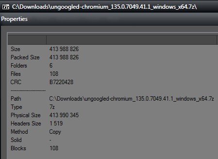
 He just used "Copy" method for the compression, it's of course bigger than "Ultra", the compression in this method is almost none. Why use 7z then? Makes no sense. Windows Zip would be a better and more logical choice in this case.
-
Wait, whaaaaat? How so? Elaborate pls.
-
Yeah, but 7z should *allegedly* compress the files, no? And it looks like it simply fails.
-
I used the drivers that came with the Xonar CD (which contained both Xp and Vista), but obviously not 11, hence I don't know and can't make judgements about 11. At that time, I had just D1, but later upgraded to the more advanced Xonar D2, The sound on Vista was fantastic, on XP and 7, very similar to what we were listening in the 80's terrible cassette walkmans. or similar to the garbage mp3. On Vista, I always choose 192Khz, of course not 44, and 44 is more like for partially deaf people, the ones who have nothing to lose in the terms of quality anyways. I served in the artillery, my hearing is damaged, and even I hear the clear difference in favour of Vista.
-
@mjd79, the new 135 is 400mb in size, is this normal?
-
So the last (real) kernel release was in 2022, I knew something fishy was going on, thanks for the warning!
-
Found it! This driver worked for that member, I don't remember, probably, and most likely I gave it. https://drivers.softpedia.com/get/GRAPHICS-BOARD/NVIDIA/NVIDIA-GeForce-iCafe-Graphics-Driver-35573-for-XP.shtml
-
Also, shell32.dll, is not needed at all? SHGetPropertyStoreForWindow replace with SHGetStockIconInfo, should be all. I wrote about it before. Basically, all others can be replaced too, but in kernel32 you would have to re-implement the function which gets the info about your locale (or extensions won't work). I could care less because I use the one and only English GB. But other languages, including the US dialect will fail to load, and you will see empty strings.
-
Fantastic result, I had trust in you, I wrote earlier. ntdll.dll, Why it's needed at all? NTDLL NtOpenKeyEx needs to replaced with just NtOpenKey, should be all, no?!
-
Thank you! Do you know how to turn off the highlighting of inactive tabs when I hover over them?
-
Mark, but this screenshot is from 344, not 347 I gave you earlier, I remembered, we had a user@UCyborg with an identical card, and it had no problems with XP. I'll try to find the driver that worked for that user. Hold on.
-
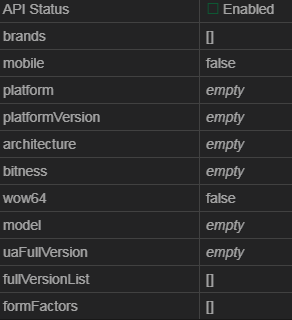
Brave https://browserleaks.com/javascript
-
Make a dedicated topic to help you diagnose the trouble.