bphlpt
Content Type
Profiles
Forums
Events
Everything posted by bphlpt
-
CMD: OPTION to jump
bphlpt replied to Caml Light's topic in Programming (C++, Delphi, VB/VBS, CMD/batch, etc.)
One ">" means, roughly, "redirect output and write to here", ie open the file, write the info (replacing whatever was there), and close the file. Two ">>" means, roughly, "redirect output and append to here", ie open the file, write the info (adding to the end of whatever was there), and close the file. Cheers and Regards -
LOL I'd laugh more, but you really can tell the difference! Surprisingly so. I will refrain from updating my posted images, however, until you are sure you've found everything that can possibly be corrected. Thank you very much for your hard work and persistence. If nothing else, others should be able to see your willingness to go above and beyond. Cheers and Regards
-
Updated. Thanks again. Cheers and Regards
-
LOL, and if you go back to Final-7/8,he was starting to look like a conehead, LOL I also forgot to directly compare the av and sig, was just comparing the av to the previous av image. The new shape is much more natural. And your improvements to the hair are striking. Thanks for being diligent, even after things were "finalized". You are an artist. Go for it. Thanks again. Cheers and Regards my friend
-
It has most definitely been an experience collaborating with you Larry on my Sig and avatar. It would not have been the same without you. I am very pleased with the results, as you can tell, and I took your suggestion and used the .png for my photo. As I've mentioned before, you are quite welcome to use any part of either image in whatever way you choose in your future projects. I'll look forward to getting the psd files for both whenever you are able to supply them for my files. I can handle them with any form of compression, or not, that you are able to do. Whenever you have them, just PM me the links. Thank you very much in advance. Cheers and Regards my friend
-
Just for you, Jed: I ran across this while cleaning out some files, (paper), has to be more than 30 years old. I don't know the original source. I thought that anybody else as old as I am might also enjoy it. For all you young wippersnappers, Google "The Beverly Hillbillies" and find the theme song - or just go here - http://www.metacafe.com/watch/2231298/beverly_hillbillies_opening_theme/ Y'all know the tune... The Computer Hillbillies Come and listen to a story 'bout a man named Jed A poor college kid, barely kept his family fed But then one day he was talkin' to a recruiter Who said, "They pay big bucks if ya work on a computer..." UNIX, that is... CRTs... Workstations... Well, the first thing ya know ol' Jed's an Engineer The kinfolk said "Jed, move away from here" They said "Arizona is the place ya oughta be" So he bought some donuts and he moved to Ahwatukee... Intel, that is... dry heat... no amusement parks... On his first day at work, they stuck him in a cube Fed him more donuts and sat him at a tube They said "Your project's late, but we know just what to do Instead of 40 hours, we'll work you 52!" OverTime, that is... unpaid... mandatory... The weeks rolled by and things were looking bad Schedules started slipping and some managers were mad They called another meeting and decided on a fix The answer was simple... "We'll work him sixty-six!" Tired, that is... stressed out... no social life... Months turned to years and his hair was turning grey Jed worked very hard while his life slipped away Waiting to retire when he turned 64 Instead he got a call and escorted out the door Laid off, that is... de-briefed... unemployed... Now the moral of the story is listen to what you're told Companies will use you and discard you when you're old So gather up your friends and start your own firm Beat the competition, watch the bosses squirm Millionaires, that is... Bill Gates... Steve Jobs... Addendum: Outsourced, that is... India... China... Now poor Jed is back out shootin' for some food. Cheers and Regards
-
As is often the case, I reran your third suggested command, jaclaz: wmic path Win32_networkadapterconfiguration where "IPENABLED=TRUE" get Caption,SettingID /format:csv and got an output this time: Node,Caption,SettingID COMP,[00000007] Broadcom NetXtreme Gigabit Ethernet,{DAF2CE16-5B38-4AFF-BF3B-FD3A4AD9D28A} COMP,[00000012] VMware Virtual Ethernet Adapter for VMnet1,{34E15011-CC8B-4568-8B26-FB3006AC01A4} COMP,[00000013] VMware Virtual Ethernet Adapter for VMnet8,{001DA8BB-0E77-4622-BA99-0BC59B2417D0} Won't try to guess why it worked this time but not before. So anyway, I guess it should work for you as well, TheWalrus? Cheers and Regards
-
I do. Keyword/XSL filename to process XML results. USAGE: /FORMAT:<format specifier> NOTE: <formatspecifier> : ((<transformname>|<transformname> : <paramstring>)[,<formatspecifier>]). where <paramstring>(<parametername>=<value>)[:<paramstring>]). NOTE: <transformname> is a <key word> or an <xsl file name>. Keywords: CSV HFORM HTABLE LIST MOF RAWXML TABLE VALUE XML htable-sortby htable-sortby.xsl texttablewsys texttablewsys.xsl wmiclimofformat wmiclimofformat.xsl wmiclitableformat wmiclitableformat.xsl wmiclitableformatnosys wmiclitableformatnosys.xsl wmiclivalueformat wmiclivalueformat.xsl Cheers and Regards
-
@jaclaz, Since I'm following along, I tried some of these commands as well just trying to learn new things. I'm just running a home machine Win7 x86 Ultimate, if it matters. Anyway, I got similar results to TheWalrus for the "second" command you suggested, and for your latest suggestion I got Invalid XSL format <or> file name. What should we be getting? Cheers and Regards
-
LOL # Final-13/14 Finalize. Publish. Thanks. Cheers and Regards
-
So, for the benefit of those of us that have been following along, what is your final script? Cheers and Regards
-
I'll make it easier. Center it. Same position vertically, but move it over to the right until it is centered. Cheers and Regards
-
Larry, I know that's part of the old man's hair, but with the limitations of dealing with a small "pixelated" image, rather that a truer png type, I know you're limited with what you can do, like trying to draw a true, perfect sphere. I had asked you to put that in because I hadn't liked the gap that was there without it. A possible way to address dencorso's comment would be to try sliding the bphlpt over, centering it at the base of the image, hiding that offending part of the hair. I had been concerned that it would crowd the other parts of the image, but since you've opened up the center of the image, it might look good. It had been the original place I had in mind for it, (remember my description saying it would be like the date on a quarter?) so I am curious. With the change of background for the letters, use whichever outline looks best, either 130 or 120. Hopefully, the hair behind the bphlpt that will be exposed with the move looks more like hair, and less "snaky". LOL I know this project has tested your patience. I'll just start calling you Job. Cheers and Regards my friend
-
The darker outline around the letters makes the name (letters plus outline) separate more from the Old Man's image, and it pushes the bphlpt letters more forward in space, since the letters seem a little brighter because they are on a darker background (i.e., background = outline in this case). The effect I was going for was for the sphere, man's head, mushroom, and bphlpt to be on different planes in that order from back to front. And since the man is at a slight angle, turned toward the front, it allows the beard to come forward tying all the foreground pieces of the image together. After moving the mushroom over, I moved the sphere over to the right 1px and up 1px to "balance" that. The image now takes up the entire 80px in the horizontal direction. To me, all the pictorial elements are now in perfect balance, position-wise. I thought it just made sense to use the full space, the full 80x80. By opening up the middle of the image, it also lets you see more of the sphere so you can better see the neat spherical effect you accomplished. Also, we have -- roughly speaking -- an equilateral triangle formed by bphlpt, the mushroom cap, and the top of the Old Man's head. (So, I guess your elementary school art teacher was right about "groups of three".) This equilateral triangle is also *echoed* by the equilateral-triangle "shape" of the magic mushroom. And another one formed by the top of the sphere, the mushroom cap and the man's head, so a triple whammy. And three points each along both right and left edge. I feel like the Count from Sesame Street. Three! Three! Three! Thank you so much work for working with me. Please finalize it, convert it, and I'll start using it. I can't wait! Cheers and Regards my friend
-
Larry, I'm sorry, I had no intention of offending with "fresh eyes", just as you did not mean to offend with "visual defects". As a fellow perfectionist I greatly appreciate your constantly reviewing your work and striving to make it better. Forgiven and forgotten? This is the first I've heard that you didn't like the 120 outline compared to the 130. When you said that it had "a tremendous effect *visually*", I thought you meant it as a good thing (trmendous is good, right?) and I agreed. I thank you very much for showing to me as I asked, but if you are not willing to implement it, then why did I think that it was as an option? Now if you had said "Here is a bad example for you to see and this is why it's bad and why I don't want to do it, I just wanted you to see so you'll understand why it's bad" then I could have understood your feelings better. Sorry for the missunderstanding. Sphere - finalized. Man's head and hair - finalized. Man's beard - After looking at the finished product with shadowing, etc, I think I actually like the beard from Final-7/8 better. (The only difference is the left edge, right?) So you were right the first time. But I will gladly bow to your eye and experience. Finalize whichever version you think is the most appropriate. No red marker necessary, no need to ask my opinion, just do it. Mushroom cap outline - You are the master of subtlty. I had to look REALLY close to tell you had changed it, but you had indeed. Just to satisfy my curiousity, and since you offered, could we try another +5 or +10? Remember, it needs a bit more change for me to see it compared to you. This will be the last request, then I'll make the final decision, and like the beard, I might very well end up agreeing with you that this is the best. i just need to see it. Since it seems that this next time will be the charm, and the final decision point, can we please see the mushroom moved this time? Cheers and Regards my friend EDIT: Oh before I forget, could you please post or give me a link for the final psd file you used for the sig? I want to tuck it away for safe keeping. I continue to marvel at the effectiveness of your subtle changes. Thanks in advance.
-
Here is as best as I can do. At least you should get the idea of the requested added areas. I'll await your complete response. Cheers and Regards

-
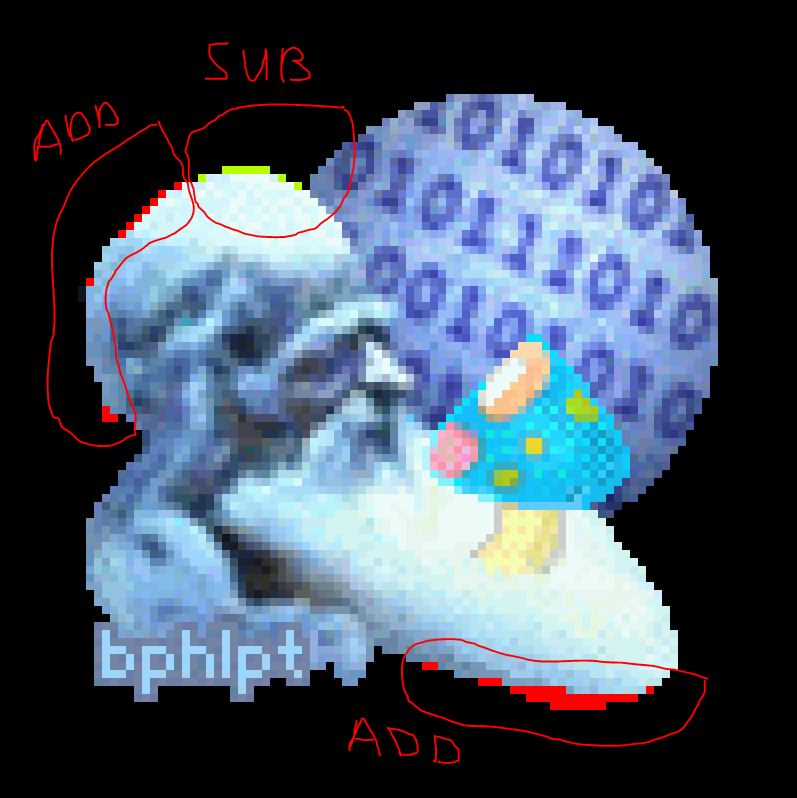
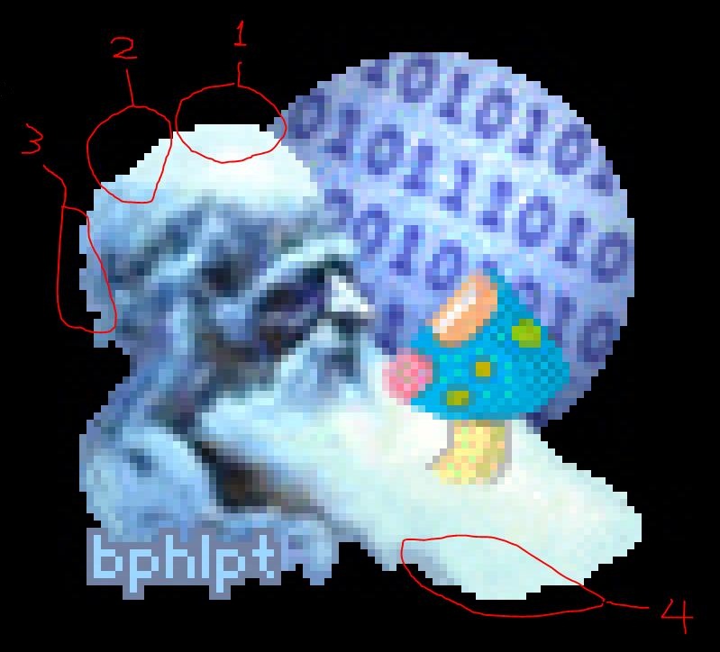
Please use the image number designations I've provided (for example, # T or # Final-8) and NOT the type of designation you have used. [For the life of me, I can't understand why you would use such a designation. I didn't pick that designation. When I saved your image N-1, that was the name that was already assigned to the file, the name I assumed that you assigned to it. I did not come up with that name. Goto the address you provided, http://postimage.org/image/2g5ixqco4/, right click the image, choose save as, and you'll see what I mean. I love the way you presented the image on a black background -- so the details could be seen -- and the way you circled (and numbered) areas that were problematic to you. Using this system, we can communicate *precisely*. I don't know why I, or you, didn't think of it sooner. So, please go back and do your *precise analysis* of that image (# Final-8) -- as you did with the image in your last Post. For example, you can put Xs on the pixels you want me to remove on the top of the head and maybe use red pixels for pixels you want me to add. Maybe it would be *best* for you to just use red pixels to arrive at the *final* top-of-the-head contour that *you want*, and I could transfer the changes, pixel by pixel, to my .psd file image. In any event, this red-pixel exercise would make it *clear* to you the difficulties associated with approximating the outline of a perfect circle by an aliased (i.e., "stair-steppy") edge. Please, also *precisely* detail (by circling and numbering) the changes *you* want me to make to the beard. Area #4 is the only part of the edge of the beard that I think needs modifying. If you want me to be that precise and make the detailed changes to the man's head that you will will then simply copy over to the psd files pixel by pixel, then just give me the psd files you have and I'll make the changes to them directly myself once I get a software program that can manipulate them. It is VERY clear to me already the difficulty in approximating the outline of a perfect circle by an aliased edge. I actually made several attempts to refine the image to show you what I wanted, and failed miserably every time. I finally gave up and just decided to point out the problem areas I had been trying to show you, thinking that you could fix them as readily as you had been fine tuning the brightness and curvature of the sphere and mushroom. I assumed that, as with most skills, that someone who is familiar with the tools and the tasks, (you), is able to do a task better and faster than someone who is not, (me). If you need me to do this precise outline before you even respond to the other points in my post, then you are going to have a bit of a wait, as I, like you, have other things I'm trying to do. And when I do work on the image with my primative tools and skills it literally takes me HOURS to do. And since most likely you will will want me to make precise explanations regarding the other things in my post, I'd just as soon do them all at once. So, PLEASE, respond to all items that were mentioned in the post, giving me an example of what you think I meant, even if it's a quick rough draft, and *THEN* I will precisely explain any differences that still remain in our understanding of what I would like. IF I have a chance to attempt to do a better job of providing the outline for the man I would like, I will do so, but please do not wait for me. Earlier, I believe you mentioned wanting to know about all the elements so you could address them all at once. Do me the same courtesy. Respond fully to my last post. Have a nice weekend. Cheers and Regards
-
# 1) The bphlpt letters with the lighter (i.e., luminosity=130) outline -- correct? No. You offerred me "improved" versions in Final-2 and Final-4 with a luminosity=120. As you stated, "This is a very small reduction number-wise, but it has a tremendous effect *visually*.", and I agreed. Isn't that a good thing? Or did "fresh eyes" make you rethink that? I like 120 better. # 2) The blue "binary-number sphere" (the darker version with PS brightness = -10) as shown in the last few images -- correct? Yes - Finalized, locked, loaded, good to go. I brightened *only the area on the Old Man's face just to the left of his nose* Love it, love it, love it! Finalized. [Re: top and back of the man's head] I downloaded your jpeg and enlarged it in PS. Because the image was on a white background, I absolutely couldn't tell *anything* about what you had done. OK, I did a lousy job of improving the look in a way you could see, so let me try it this way. I blew up your image "zzzzz_N_1_no_outline_on_black_background.jpg" and have annotated it with what I liked and didn't regarding the shape of the edge. 1. I had thought this area was fine - like you say, it's the same as the top of the sphere - but whatever you think. 2. This looked dipped in to me and I thought it needed to be filled in a bit. 3. This is the part of the hair I thought needed a little bit added/smoothed or something. Note that I thought the little piece hanging down below it was fine - hair does that. [Re: beard] So, following your input, and my better sense of taste also, I went back and repaired the bad barbering job -- as shown in the images in this Post. I like the way an additional somewhat deeper shadow is introduced at the bottom of the left side (viewer's POV) of the beard. Thank you for filling in that gap. Feel free to do more, or not, as "fresh eyes" look at it. But let's add just a touch more beard to the left side (viewer's POV). Shape wise, something between what you now have in the latest image and #4 in my posted image above from your N-1, going for a look that's a little bit unkept, not quite as tailored, in the same way the hair is not tailored either. See also my image in post # 106. But I love the color and deeper shadow as you now have it on that side, so keep that. On looking at the images in my last Post with "fresh eyes", I decided that I didn't like the smaller-sized mushroom cap (it seemed too small compared to both the mushroom stem and the Old Man's face). So far, I've been quite satisfied with your sense of scale, so whatever you feel is appropriate. [Re: mushroom cap outline] The color is in the "aqua family" ... I think this color works great in the picture because the Old Man and the sphere have very strong blue components also. ... I hope you find that your mushroom flouresces a bit more and glows even more magically ... And now the cap outline is gone? I don't see it. I like the changes you've made as to the mushroom's overall brightness, making it appear less flat, etc, but let's put the outline back - like there is a light behind the mushroom. If it is there, and the other changes you've made no longer make it show up (to me), is there anything you can think of to make it more visible to me while still looking good to "regular" people? LOL If it needs to be added back, I'll leave it to you to decide if it would be better to replace the current edge of the cap, or add the outline in addition to what is there, making the cap larger. Whatever you think is best. I moved the blue binary sphere over to the right 2 px, to accommodate changes made in the images given in this Post. The actual image -- all elements included -- now occupies an area 79 px wide by 75 px tall. I'm not sure I understand what changes made this necessary, not that it matters, but it's fine with me to spread the elements out all the way to the edge of the 80x80 space to give you as much room as necessary so that there isn't any sense of crowding. Take the entire 80x80. We no longer have to take any kind of overall outline into effect, so go for it. Raising the sphere will show more of it, increasing it's volume, which might help the scale compared to the mushroom. I'm just as confused as you. Let's start over on this one to be clear: Case # 1: move the sphere over to the right and down - Nope Case # 2: move the mushroom over to the right and down - YES, YES, YES! Clear? LOL Case # ?: any other case you had in mind - Nope The only case I've ever asked for is Case # 2. Roughly as I pictured in post # 106. I've never considered, or mentioned, any other case. I certainly don't want this project to turn into *my real-life version* of the movie "Groundhog Day". LOL ! I'm sure you have seen this movie -- a *true classic*. This has felt like that a little hasn't it? It's hard to believe that it's been over 18 1/2 years since that movie came out. Bill Murray was great. Andie MacDowell actually lives in this part of the country, only about an hour or so drive from where I live. I think we're about to break out of the loop and move on, so until next time. Cheers and Regards my friend
-
Follow the links at the top of most of the pages for Syntax - Parameters. Cheers and Regards
-
Another favorite site that I use, 5eraph, as I know jaclaz does as well, is this one - http://ss64.com/nt/syntax-args.html. Cheers and Regards
-
I didn't mean to offend you by my use of the term "visual defects". That was just my way of "briefly" referring to your situation. I'm sorry. BTW, what is the proper "politically correct" term? I didn't think you meant to offend. I didn't think you were that kind of guy. You just sounded like an artist who is justly proud of his work. (And maybe just a tiny bit of the opinion that "Of course my is the right way!", but isn't that really just human nature?) And I think the PC thing to do is to just ignore it. It's no worse a "defect" than near/far sightedness, even though they haven't come up with glasses to correct it, yet. And I think of it kind of like being left-handed, which I'm not, it's just different. Or like people who are tone deaf and can't sing. That doesn't prevent them from enjoying the event or listening to those who can. So while color-blindness would make a career as a surgeon a problem, and as an electrical engineering student reading those darn resistor color bars was a b***h, color-blind people were sought out in World War II as bombardiers in the Air Force since they were not fooled as often by camouflage, but rather would pick up movement. So no need to discuss it further. I really don't want to settle for an imperfect solution. I want to find a single "universal" solution that works for you, for me, and the rest of the world. By simply varying the parameters, we should be able to find such a solution. That is my goal in this project. I think that you'd agree that this is a worthwhile goal to pursue. I agree. I made the outline *aliased* instead of anti-aliased, as you saw in the images in the last post. This will make the outline *more readable* (and the outline will not be as "fuzzy thick", so the cap will appear a tad smaller). In all future dealings with the cap, I plan to use the aliased outline. After reworking the cap outline, I applied PS brightness = +8 to the entire mushroom (stem and cap) to arrive at images # Final-5 and # Final-6. To me, the mushroom cap stands out well -- primarily because of its brightness -- and I can still see the outline, somewhat subtly. To me, this mushroom looks more "natural", and it doesn't seem too bright. The cap appearing smaller is fine, and I think the overall brightness increase is good. For me to see, and distinguish, a color depends on several factors, as I suppose it does for everyone, but it's more of a factor for those of us with "special eyes". (Forgive me if I don't use the correct terminology.) Those factors are the color, the colors surrounding the color, the brightness of the colors both absolute and relative, the brightness of the environment, the texture or reflectivity of the surface, and the amount of the color. In this case, the last factor comes into play. When the image is enlarged, I can see the oultine just fine and I can appreciate the fine subtle line, but at normal size, I lose it. That's part of my problem of just seeing the mushroom against the sphere. As we've made it smaller, though it definitely is a better scale to the other elements of the image, I have less to deal with. As I explain in post 106, I also kind of like the flourescing effect of the outline, though if it would be the same after the brightness increase, I don't know. As to looking "natural", we are talking about what looks to me like a blue mushroom with pink and orange spots, so ... IMPORTANT: Next, I'm going to try to brighten -- a little -- *just the area in the face* to the left of the Old Man's nose. This should give a really nice, subtle effect. I really can't brighten the whole face, hair, and beard because all the subtle shades of white would get "blown away". I think the brighter face will work well with the brighter mushroom. (The face in your signature is appropriate as is, IMO, for the environment it is in. I'm considering brightening the face in the avatar because it's now in a *different* environment.) This sounds reasonable. That's all the comments re your post #107. Until next time. Cheers and Regards my friend EDIT: I believe all my comments in post #106 will still apply after implementing the comments in this post.
-
Image critque time. Note I did NOT say criticism, because I really do like almost everything you did. So T and M-1 are the same? To my eye they are. Of course they are not the *same*. ... They look the same on a white background because the transparent GIF was made correctly. (Slap myself on my forehead) Duhhh. I knew that! I was just looking and comparing images visually and totally forgot to notice the file extension. (Sheesh, I feel really stoopid. LOL) So maybe you could just make the edge of the back of his head a bit less "jagged"? Done. Thank you. I noticed that after all the successive images, his head was getting a little "flat" on top, like somebody bashed his head in (like I'm sure you've wanted to do to me at times), so in the image below, I rounded it just a touch and added the least little bit of hair back in to not look too smooth.. Does it look too much like a helmet now? I've told you, I can't draw. I'll go with what you think looks best. The man's size and the shape of the sphere are good. You are correct. It really does look good. Fills the "frame", details are well defined, relative sizes of the two are good. But could you do a version of bphlpt with just a touch more contrast, or maybe just a darker outline? Yes. ... This is a very small reduction number-wise, but it has a tremendous effect *visually*. It is surprising that very small adjustment is really noticeable, while still keeping the letters subtle. Thank you. I'm all for modifying the beard in any way that helps it look less like it's sticking straight out like a tongue, as dencorso described it. I went for dencorso's football look -- more or less. I love what you did on the right side (his left), but on the viewer's left (his right) I'm not sure why you removed quite so much of the beard and especially the hair. To my eye, (color has nothing to do with this) it leaves too drastic an arch, or gap, that I don't quite understand. I think it looks better a bit more filled in. I'm in no way married to having exactly the hair and beard as I drew it, especially since I can't draw, but I think it needs *something* there. Maybe adding a bit more subtle texture? I made these shadows so that the depth of the beard would be increased somewhat. Very good. As to the brightness of the sphere, darkening it a touch might be good, we could try it. In the images shown in this Post, I darkened the sphere by a PS brightness = -10. IMO, this helped the overall look. I agree. Perfect. I guess I suggested darkening the entire image a bit because there almost seemed to be a bit of "glare" coming off the man's forehead and part of his beard. But if you want, we can make the final overall brightness adjustment, if necessary, after everything else is finalized. I toned down the "glare" coming off the Old Man's forehead some. That's MUCH better. You are giving the *totally incorrect approach*, IMO, ... That's because I have no artistic ability or training and don't know the correct terminology to use when I'm trying to explain myself. Your toning down of the man's forehead and, I think, part of the beard, and adding more shadow/texture accomplished the goal I wanted, so we're all good. I agree that the previous border around the cap was too harsh, but I NEED it to have one, however slight and subtle you can make it. I based the outline around the mushroom cap on the letter color and adjusted the brightness to get what is shown in the images. I like the effect of the lighter outline. Almost as if it's flourescing slightly in the night. Or dimly lit internally. After all, it is a magic mushroom. [NOTE: To me, probably because it's surrounded by so much blue, I see it as a very light blue. What color is it?] After outlining the mushroom cap, I brightened the entire mushroom (cap and stem) by PS brightness = +5 to help it stand out a little more against the darker binary sphere. I then added a *highlight* to the mushroom cap to give it some curvature. By comparing this mushroom cap to the cap in earlier images, we can see just how *incredibly flat* the cap was in the earlier images. A very noticeable improvement. Great ideas. Well implemented. (re mushroom) Also, bringing it back down and to the right so that the edge of the cap sticks out distinctly compared to the edge of the sphere and beard helps as well. That will also help it appear lower and more forward, to me. I tried moving the sphere down and to the right by just 1 px in both directions, as you suggested, and, IMO, that looked *terrible*. I didn't ask for a little movement, I wanted a big one. To put it back closer to where it's been all it's "life". By adding more sphere area (i.e., dark area) to the right of the mushroom cap, the viewer's eye is drawn more *in that direction* and not in the direction back to the Old Man's face, as it *should be*. I'm confused. How is moving the mushroom down and to the right, therefore covering up the edge of the sphere, "adding more sphere area (i.e., dark area) to the right of the mushroom cap". I must be missing something. Also, we lose that neat effect of the bottom of the mushroom cap "exactly paralleling" the edge of the sphere. Again, not a color question, but as non-artist, I'm missing something. Why this is "neat"? It's "cute", but I'm more like, "If it happenes, that's great, but it's not enough of a feature to make me want to keep it there." I think the mushroom is too close to the man, unless you were going for the viewpoint that he was going to take a bite of the magic mushroom? Hmmm. One of the very few things I remember from elementary school art class, was that you tried to put things in groups of three or five. Well by moving the mushroom down and to the right, you have the edge of the sphere, mushroom cap, and beard all roughly lining up with the right edge of the 80x80 space, just as you have the back of the man's head, his shoulder, and the edge of "bphlpt" all roughly lining up with the left edge. While the bottom of the bphlpt and the bottom edge of the beard roughly line up with the bottom edge. To me, this seems more balanced. As we've bantered back and forth over this last week or so, as I've asked for various things that you've disagreed with, I have, more often than not ended up agreeing with you, after I've seen the result. I guess I just don't have the experience or mind's eye to picture it without it actually being visually in front of me. Would you please make two versions, one with the mushroom where you think it should be, and one with it roughly where I've shown it below. I'll pick one and we can wrap this project up and you can move on to the next customer. Note: I made no effort to fill back in the space where the mushroom had been. Editing the jpeg in that way did not seem necessary for this example. I'm looking forward to next time. Cheers and Regards my friend
-
I stressed my color blindness caused deficiencies in my last post merely to emphasize that the problem with the avatar was not your ability as an artist, but my inability to see some of the subtlties of your work. I also said that what I requested was necessary "for me", again to put the burden of responsibility of using an imperfect solution in my lap, so that you would not be judged poorly for this choice. I don't appreciate being reminded that I cannot clearly see the much better image (IYO) -- and how my visual defects cause me to use a worse solution to the problem (the artificial outline). I've seen this way my entire life, and I only know that others don't see the way I do because I've been told that. You say you have no idea how I will perceive a certain color. Well I have no idea how you see it either. Now that we both understand that clearly, can we quit referring to them as my "visual defects"? (Very politically incorrect.) Between your rendering the image and my ability to see it, guess which is the only one either of us has control over to modify and which one we both have to live with? While you are working wonders in improving my original image and adding in the elements which I suggested, in roughly the position I suggested, since I do not currently have an installed program that can manipulate .psd files and you have much more artistic ability than I have, you currently have control of the work in process. I know from your earlier posts that you want things *perfect*, as do I, perfectionism is my curse as well. But unfortunately my vision is not perfect, so we both will just have to make allowances. You have also stated that you are willing to work with anyone who wishes to use your services to make it *perfect* for them. Well, this is to end up as my avatar, one we have established that I plan to enjoy for a long time. Overall, I like most of the changes in the image A LOT! I'll respond in detail separately. I just wanted to get this off my chest. Cheers and Regards my friend
-
I can see how this would help the OP. It's not that he's trying to improve the quality of the image by converting, just the effectiveness of the the display of the image, if you will. ie for his particular system, OS, CPU, memory, media player, codec, etc displaying .mkv files takes just a little more "horsepower" than he can provide, so the display suffers from pixelation. He does not have the same problem with .avi files. I had the same problem a couple of years back. I wish I had the answer then, and I wish I had it now to give you. Please let us know if you find a program that is effective for you. Cheers and Regards
-
Is it a good idea to alter win cabs so patched ESDI_506 installs?
bphlpt replied to keropi666's topic in Windows 9x/ME
You can find his website contact info by looking at his profile - http://rloew1.no-ip.com/ Cheers and Regards