bphlpt
Content Type
Profiles
Forums
Events
Everything posted by bphlpt
-
Don't ever feel a need to apologize to anyone or explain why you didn't post back with more images right away. If anyone complains about the "delay", tell them that they need to at least double whatever they are paying you. LOL So T and M-1 are the same? To my eye they are. I'm glad you ended up coming back around to my view that it looks better without the overall outline. I think what I, and you, had liked about having the outline on the back of the man's head, was that it "smoothed" the edge of the hair a little and didn't make it look as "jagged" as it does without the outline. So maybe you could just make the edge of the back of his head a bit less "jagged"? The man's size and the shape of the sphere are good. The relative brightness of "bphlpt" seems similar to that of the "bphlpt" in the sig. Subtle. I would have probably chosen something with more contrast on my own, but I like the effect you achieved. My nik will most likely be elsewhere in any post where either or both of these are displayed, so there is no need to have "bphlpt" blatantly plastered all over the place. That would just be juvenile. But could you do a version with just a touch more contrast, or maybe just a darker outline? (Since it is, to me, of a similar brightness and color to the hair, and maybe because of my color blindness [see comments below], against some backgrounds it is hard for me to see.) The sig shows up fine. I'm all for modifying the beard in any way that helps it look less like it's sticking straight out like a tongue, as dencorso described it. In the sig, it's obvious that he's reclining, causing the beard to stick out as it lays on his chest, but the avatar does not have that frame of reference, so anything you can do will be good. The ZZ Top flat look doesn't help, as much as I like the band, especially that song. Maybe adding a bit more subtle texture? As to the brightness of the sphere, darkening it a touch might be good, we could try it. I guess I suggested darkening the entire image a bit because there almost seemed to be a bit of "glare" coming off the man's forehead and part of his beard. But if you want, we can make the final overall brightness adjustment, if necessary, after everything else is finalized. I'm not as happy with the "new mushroom" as you are. Keep in mind that it very well could be that part/all of it is my problem due to my aforementioned color blindness. I've seen web pages that have bright red letters against a blue background (the background colors of your images # O and # P) - I don't have any idea how those look to "normal" people, but I can not read them AT ALL, and it gives me a headache to try. I can't see dark red roses or holly berries against the dark green leaves unless I've been told they are there and really stare at them a while. I know "normal" people can see all the numbers and letters in those color blindness test circles (remember those?) while I couldn't. In the same way, a lot of your "improvements" to the mushroom are not only lost on me, they make it worse. Don't ask me to explain how a particular color looks to me, because it would be like trying to explain how a banana tastes to someone who has never tasted one. Without a common frame of reference, it's very tough. Moving the mushroom up, shifting it left, and removing the border makes me TOTALLY LOSE IT against the sphere. Subtle is one thing, but invisible is something else. I can only see it under magnification. All your comments about how different parts of the cap still show up clearly against the sphere are, for me, wrong. I agree that the previous border around the cap was too harsh, but I NEED it to have one, however slight and subtle you can make it. Darkening the sphere a touch will probably help give a little contrast, too. Also, bringing it back down and to the right so that the edge of the cap sticks out distinctly compared to the edge of the sphere and beard helps as well. That will also help it appear lower and more forward, to me. In my mind it is in front of the man, closer to the viewer. I know you are very proud of the "new mushroom", but it won't work. On a positive note, the size reduction is good. I also like the softer outline around the stem. Both of those aspects are good. So, can we try again? Cheers and Regards my friend
-
Sorry I'm too used to having 91% and denatured (also usually good enough for this type of cleaning in my experience) available even at local corner convenience stores for 2USD. 99% can be ordered online for about 10USD. Cheers and Regards
-
I'm not sure why you asked the question, since you seem to be intent on just using what you have. LOL I don't know what the conditions are where you live, but isopropyl should be readily available and very cheap. You should have been able to go to any grocery store or pharmacy and bought some in the time this thread has taken so far. Cheers and Regards
-
 jaclaz is trying to take you through the steps to learn the why and how, (kind of like school) so the next time you have a similar task you will know how to create the script for yourself. And Yzöwl obviously knows MUCH more about robocopy than I do. I would STRONGLY advise listening to them both and going through EVERY step they suggest. Consider it an honor that these teachers both are willing to spend the time with you. To answer your question, in my script, "%1" would be the robocopy source, but its completeness and appropriateness as a path is dependent on how complete the "SpecificDirx" is. "%~n1" is the specific name that matched one of the members of your list. Yzöwl did a much more thorough job than I did on breaking down the robocopy command elements and the source and destination paths to make them all easier to handle. Cheers and Regards
 -
No, I meant like this: @ECHO OFF & SETLOCAL ENABLEEXTENSIONS ENABLEDELAYEDEXPANSION SET _DirList=DesiredDirectories.txt CALL :f_CopyDefinedDirs SpecificDir1 SpecificDir2 SpecificDir3 EXIT :f_CopyDefinedDirs %_DirNames% SETLOCAL ENABLEEXTENSIONS ENABLEDELAYEDEXPANSION :s_DoUntilNoMoreDirsToCheck IF ['%1']==[''] ENDLOCAL&EXIT /B 0 IF EXIST %1 ( FINDSTR /i /x "%~n1" %_DirList%> nul && IF %ERRORLEVEL% EQU 0 ( REM REM REM Do your RoboCopy thing here REM 'You might want to check to make sure the directory is not empty of files REM first, but that is left as an exercise for the reader' REM REM ) FOR /F "tokens=*" %%G IN ('dir /-B /AD %1') DO IF EXIST %1\%%G (CALL :f_CopyDefinedDirs %1\%%G) ) SHIFT & GOTO s_DoUntilNoMoreDirsToCheck Note: DesiredDirectories.txt should have each desired directory listed one per line. as in the OP's example. And yes I know that more error handling might be required depending on the directory structure he has to deal with. Cheers and Regards
-
One enhancement will be to use recursion to get to the subdirectories 0001, 0002, etc. Cheers and Regards
-
Or even curled up a bit at the end like curled up fingers, or curled around the base of the mushroom like crossed hands rather than laying flat, or both - just throwing out additional random thoughts. Oh, by the way, I think your overall spacing of all the elements is WAY better than what I had. Cheers and Regards
-
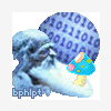
Looks good! I'm waiting all a'tingle! LOVE the sphere! And, I admit, I like the bphlpt under the man where it makes much more sense, rather than centered. And the overall outline does unify things. Since you now have the overall brightness balanced better after +10 to the old man, maybe try a -5 or -10 or so to the entire image? It looks a little bright. Just a thought. Overall, I really love it. I'm so glad we got together! Cheers and Regards
-
While I "followed" your detailed explanation of the mid-value-colored outline, I'm afraid it's an artist talking to a non-artist. I'll just wait for your post so I can see it. I think we're probably on the same page again, just talking different dialects of the same language. The fuzzy oval is not important at all, but was the only tool I had to make the letters stand out against a varied background. Any way you do it so the letters are readable is fine with me. EDIT: You've mentioned using white letters, but if you extend the beard/hair wouldn't dark letters look better against the light colored hair/beard? As to my backtracking on the border, not really, again probably just different terminology. I said that putting the bphlpt on top of the other elements would allow the resulting image to have a continuous border (rather that the letters being out on their own as yours and my examples have shown them thus far), and you interpreted that to mean to add a continuous border, which very well might be a better idea. I don't think I'll mind those rare cases that the forum background matches part of the image "edge", as long as it looks good against black and white, but the added border might well make it pop that much better, I don't know. If the letters were out on their own, having the forum background match their color would be a disaster without some kind of help. I love what I hear about the improved sphere. It definitely sounds more professional. I love the tie in to the past versions. I agree my pic looks crowded, which was my main concern when I first had the idea of putting all the elements in there. You're welcome to expand and move things around as necessary. As long as the result fits in the 80x80 area you can go right to the edge in any and all directions. Leaving the added border off would also give you that least little bit more room to play with, wouldn't it? If we have to end up leaving the bphlpt out, I would consider that, but I think putting the letters on top of the other elements should be fine. Looking forward to next time. Cheers and Regards my friend
-
SATA to IDE adapters: which/what/why?
bphlpt replied to dencorso's topic in Hard Drive and Removable Media
Your tests all seem to be for adapting a SATA drive to a PATA motherboard connection. I've seen some documentation for some adapters that say their adapter works bi-directionally - ie also for PATA drive to SATA motherboard connection. Do you know if this adapter also does this? Cheers and Regards -
Using my very poor drawing skills I came up with this as an example: I would expect that the ellipse color would be chosen to match the hair/beard color, just kind of blurred to make an even backdrop for the letters. But the same effect could be achieved without the ellipse with just a border/shadow around the letters that is the same color as the hair/beard. Just anything to make sure the letters are readable against whatever the background is. I can't wait to see your artist skills in action how you extend the hair/beard to see how that looks. I'm not sure about the overall border. But you probably know best. Let's try it with and without. Cheers and Regards

-
LOL No no, I meant this comment to apply to the bphlpt in the hair/beard or on the fuzzy oval/ellipse/cloud like idea. I perfectly understand the problem of the curved letters. Your explanation was very clear and made perfect sense. Cheers and Regards
-
Sounds good. I'm glad you think we should keep the mushroom as it as. It's kind of a hippy, psychedelic look which fits with my age. (Ah, memories of high school and college in the 60's and 70's!) One final, (Ha!) request. I've thought more about my comment about the possibility of using 'some kind of "fuzzy" background behind the letters', and I'd like you to please try that. It would give the avatar a continuous, single border rather than having the letters "on their own". Don't get me wrong, I really like the way that the letters stand out on their own, especially against the extremes of a solid white or black background, But if there were some kind of narrow "fuzzy", or cloud-like oval or ellipse tying into or overlapping onto the man/mushroom if necessary, depending on the final height of each, with the letters in a contrasting color, that would guarantee that they would always be able to be read, no matter what the forum background ended up being - white, black, any solid color in between, or even an obnoxious, dizzying pattern. I like the idea of the reliability and stability of how it would look, not to mention the flexibility and simplicity. Even if the forum background was such as to blend in with the sphere or edge of the man's head it wouldn't matter. I just had another "hair brained" (pun intended) idea. You might could do this as an artist where I wouldn't have a prayer. Extend the man's hair/beard down a little, even wrapping around the bottom edge of the mushroom a tiny bit, as if the mushroom is growing up through it, and use a relatively even colored section of it as the background for the letters, blurring the hair at that point just to give a good contrast to the letters, but only just behind the letters - kind of like the shadow/outline of the "larryb123456" in your sig give them a uniform background. The resulting increase in overall volume of the man might help emphasize his importance in the image and better balance him with the size of the mushroom - just a thought. That might also allow you to center the bphlpt at the very bottom. I know the avatar is square, but there are so many curved surfaces it gives a feeling of being very roughly curved to me - just allowed to run wild and spill over the edges of the sphere. So the bphlpt at the bottom would act like the base - like the date on a quarter. But, no matter where it ends up, centered or offset, keep it flat. Don't curve the bphlpt. If you try a rough draft and it looks terrible, go ahead and show me a bad example to convince me it was a bad idea. That way I won't sit there and wonder "What if?". And if the hair extension idea doesn't work, please try the fuzzy oval/ellipse/cloud like idea instead. I've lived with my current sig/av for close to ten years, and I plan to live with what we come up with for at least that long. Your coming along and offering your services has been a blessing. Thank you. I hope you're not sorry you got involved with me - this has been useful and fun. Maybe it will also help you drum up other customers. I think one of the early suggestions to you of showing a page full of examples of the type of work you're capable of could be useful in giving people ideas as well - kind of like a portfolio. Feel free to use the work we did here together, either finished images or the building blocks, in any way you so choose with no restrictions whatsoever, either as examples of your past work or even in building blocks for others. If I see pieces of it elsewhere, I'll know where it came from and I'll smile, remembering this good experience. Cheers and Regards EDIT: As you can see, I've happily adopted your improved version of my sig, in a slightly reduced quality, being sensitive to CoffeeFiend's concerns as to overall file size. it's now a comparable file size to what I was using before. I've compared this to your PNG version expanded over 300% and saw no differences within reason, so I'm happy with it. As such, when it's convenient, I'd like to get your PSD file to store away in case either you or I wish to do anything else to it in the future - though I can't imagine what that could be. You put the PERFECT polish on it that it needed. Thank you.
-
Size limitations haven't changed - 80 x 80. My combined image I posted was simply my crude attempt to copy four copies of your image, along with two copies each of my two rough drafts, all roughly 80 x 80 so that each of my images is shown along side one of yours, on both black and white backgrounds. Any result that is not perceived as 80 x 80 was unintentional and due to sloppy and off-center cut and paste. The two on the right are the same images, just different background. Same thing on the left. I'm glad you like the free flow hair. I do too. I'm fine with keeping the sphere the same size as #10, and adjust the size and position of the man and mushroom to fit/look the best. And I'm not saying the mushroom NEEDS to move or be resized, it might be just fine where it is. I just meant if you think it would look better moved, you're free to try that. I think we're on the same page. I'll look forward to seeing what you come up with. Cheers and Regards EDIT: Something that I also think would be good is if the numbers in the middle of the sphere are slightly larger than those along the outside edge. I THINK that would give it a more three dimensional look as if the numbers were wrapping around the sphere, rather than laying flat in a two dimensional plane. But I could be wrong. There might not be enough room to give that effect, so don't beat yourself up about it. In fact, I got back on line to suggest this because I thought I remembered that the original sphere had this effect. But looking at it now, it doesn't seem that it does. It might be the shading of the sphere that gives that effect. So if you do try it, it probably only has to be a subtle difference to achieve the effect. Anyway, just another of my hair brained ideas.
-
Your idea was slightly different than mine. I had thought of the "moon" and the man and the mushroom on 3 more distinct layers rather than the man in the moon look. Just using Paint.net, as you can obviously tell from my crude attempts, I made two different tries at it using two different sizes of the man. comparing them both to your version on both white and black backgrounds. The smaller size had been my original thought, but I think I agree with your decision of the larger size being better. Maybe somewhere in between, but definitely closer to your size. After all, he should be the main character, not the moon. Having more of the man visible by being in front of the moon will also add to his importance in the image. In yours, the mushroom almost takes up as much volume as the man and in a way seems to be more the focus. The man could be slid slightly lower, so that the moon appears to be more above him rather than behind him, but I'm not sure. I guess the mushroom might even be reduced, slightly, in size, but I'll let you play with that if you like - I'm fine with it as it is. I had also originally thought of putting the bphlpt superimposed over the man/mushroom, but I really couldn't find a good color for the font that would show up well against them, so you probably made the best decision there, too, unless you used some kind of "fuzzy" background behind the letters, but probably not. I'm also not sure about your choice of moon color. I agree that it does make the man show up a little better rather than against the lighter background, especially against a black forum background, but against a white forum background, the 101010 really gets lost to my poor eyes. And against the black background, as good as the man "pops", the dark moon doesn't. Not that it needs to pop, but maybe be a bit more noticeable? True, it matches better to the sig, which I continue to love, but the mushroom doesn't match the sig either. I thought about getting a mushroom image that matched the ones in the sig more, but those are really more part of the background. The sig also has the extra writing, the laptop, the tree trunk, etc on it as well, so I don't feel we necessarily have to match the look of all the elements, as long as the basic elements are represented, which I think you achieved. Anyway, take this not as criticism or even suggestions, but rather just as random ideas I'd like your feedback on and something we can compare our thoughts on. Looking forward to our continued conversations. Cheers and Regards
-
@Geej: One thing you might not have caught, that is if I got it right, was the OP explained was that he was working on his own personal computers for his own personal use, presumably back at home once he gets them set up the way he wants them, thereby staying within nLite's license. The fact that he happened to be doing this at work, with his employer's permission so probably during breaks or after hours ie on his own personal time, should be irrelevant. If you think it is relevant, then do you also think that the opposite is true - ie if you take a work computer home, with your employer's permission of course, use nLite on it at home, and then bring it back to work to use it at work, then is that OK? I don't think so. nLite's license, which gUiTaR_mIkE quoted only mentions how nLite can and cannot be used ie only for personal use, not where ie what building you happen to be in. I think the OP's question is legitimate. He just gave too much information and confused the issue. So jaclaz was correct, and within the boards rules, in providing assistance. Especially if the problem has nothing at all to do with nLite anyway as jaclaz suspects. That's just my two cents. Cheers and Regards
-
No need to live with #9 - I like it! The brightness of bphlpt seems very appropriate, better than I had, and still bright enough. The cleanup under the laptop is also VERY nice. All the details of the laptop are now clearer and the laptop is OBVIOUSLY either resting on the old man's knees or on a cloth draped stool or stump next to him. Unless you find something in the original psd you want to use, or it allows you to create the image with any better detail or focus, I think we have a winner! I personally can see nothing that needs to change, but your eyes are better than mine. Cheers and Regards
-
Of the GIF's you produced, #5 is by far the best, as you already knew. LOL I can understand your point about having specialized backgrounds for different forums, and even more than one per forum when they offer different skins that change the color scheme. But hey, I'm as lazy as the next guy, so just having one with a transparent background that you can put anywhere and not worry about it is much easier. I was comparing #5 to the PNG #6 and noticed that when you "improved" the image, #6 actually "grew" down and to the right. I noticed this by opening the two images in different tabs of my browser and switching back and forth between the two. Nothing of consequence at all, just was a curiousity. Anyway, I took the #7 PNG and ran it through a "Convert to GIF" right click option program I've had for so long I've forgotten where I got it or even what the name of it is, and it made the image I've attached below. Comparing it to the PNG and JPG in three different tabs shows no perceptible difference at resoloutions up to 300% on a white background. BUT, since there were a few white pixels in the image itself, it made those transparent as well which shows up on other backgrounds. Could you doctor it up for me just to get the last few kinks out? Your eye for the artistic nuances is FAR better than mine, and I am color blind. (Typical male red-green, really, I am - that's why I either have to rely on programs with automatic functions or depend on kind folks like yourself.) In my reading and searching for programs that could do a PNG to GIF transform for me, I discovered that PNG's can also have a transparency layer, which would seem to be a way to have the best of both, but I don't know if any imaging software that can handle that task can run on your system - you'll have to check that out. Other than the above and waiting to see what the idea you had was about adding the old man and the bphlpt, I agree that the avatar is as good as I'll need it to be, and just the way I want it. Carry on the great work! EDIT: Looking at this post and being able to compare the work you've done to my current avatar shows just how badly I needed your help! And I used to think what I had was OK - well, no more! Cheers and Regards
-
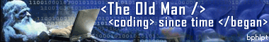
Thanks for the work on the avatar Larry! You could really tell that I just threw a couple of stock jpegs together in a Paint type program, couldn't you? Great job on smoothing out the sphere. I REALLY liked it better when you made the sphere perfectly spherical. That was MUCH better. [it was jagged due to the automatic settings in the program I used to convert the jpeg to a gif and add the transparency layer.] I wouldn't of thought of adding the extra outline. It looks good on a white background, but on a black background the extra outline looks a little bright. It looks kind of like a halo is around the sphere. Maybe if it was narrower by at least half? Or it might be better to just leave it off - try it and see how it looks on both white and black backgrounds. The more I look at it, the more I might like it, but I'd rather have a more uniform look regardless of the background. Play with it and see what you think. I also like the brown outline of the stem, a nice finishing touch, but maybe a slightly darker brown? Overall the avatar looks much better, but then how could it have looked worse? LOL I would like you to please round off the far right of the mushroom cap though - it looks a little "cut off". The size of the avatar is fine at 80x80. I would prefer if we can have it end up as that. I see no reason to use any more space since all the elements are visible as it is. I also want to minimize the size of the file as small as possible without any apparent visible differences and keep the transparency layer, so I guess that means staying as a gif? As to the sig, I see nothing wrong with what you propose for it. It doesn't matter to me whether it ends up as a gif, jpeg, or png. Like the avatar, I just wanted it to end up as the absolutely smallest possible file without visibly degrading the image. The dimensions of it are fine as is. To make it easier for you, I've attached the original psd file for it below. It was made for me back in 2003 at another forum in similar circumstances to now. Someone was volunteering to make sigs. I told him I wanted the old man, mushrooms, night time, and coding elements, and that was what he came up with. (Note the misspelling of bphlpt, so you'll need to correct that, as I had to do when I got it, and maybe use a smoother font?) In fact, that might be something to consider for the jobs you do for others. In addition to providing the images to them in jpeg or whatever format, if you also give them the psd file as well, then if they ever do want to make any changes or fixes to it, then they can operate with the original file to maintain the quality of the image. I will want the psd of the final image. I also attached a gif of a version of the image that had the 10101010 layer more prominent, but at the time I thought that it detracted a bit from some of the other background elements. Do you agree? I'm not sure I still do, but probably. I had tried to tie in similar elements to both avatar and sig - blue as a major color, mushrooms (because I felt like I was treated as one - kept in the dark and buried in s**t compost, LOL), 1010101 representing programming, night since that seemed to be when I did most of my programming - the sig is supposed to be in moonlight and the avatar sphere is like a moon, but I missed the old man part in the avatar. Could we possibly add that in and not have it look too crowded? Maybe the old man's head, reduced in size if necessary, to the left of the mushroom and in front of the sphere? The mushroom could be in front of part of the beard if necessary and could even be reduced in size. And maybe even add in bphlpt superimposed centered across the bottom? Then it truly would be a unified set. Those are just crazy thoughts, so if it just ends up looking like a mess we can scrap that idea. I guess that's an indication that you do good work - when people expect you can OBVIOUSLY perform miracles until you finally tell them NO! I really appreciate your enthusiasm and work ethic. I'm looking forward to seeing what you come up with. Cheers and Regards bphltp_sig-orig.rar
-
Thanks, Yzöwl! Cheers and Regards
-
Well, I'd be interested in seeing what you might come up with for me. I like my current avatar OK and my sig a lot, but they might could both use some polishing up. I don't necessarily want to change their general themes too much, but the avatar especially is a little rough around the edges. Any ideas? Cheers and Regards
-
@Larry, you have obviously put a lot of work into this. It is apparent that you enjoy working on it and learning new tricks as you go. I hope you find people who wish to use you work. Cheers and Regards
-
Copy only files that have newer version?
bphlpt replied to tomasz86's topic in Unattended Windows 2000/XP/2003
@CoffeeFiend, I think that tomasz86 said he would be glad to test your code on the files he uses. Since he is familiar with those files, and he is the one that would benefit from the code, it seems that would make sense. Cheers and Regards -
My findings were similar to dencorso, looking at the images in different tabs of my browser, Iron on Win7 x86, the PNG was darker than the JPG. And when I downloaded the two images and loaded them into Paint.net they looked the same, both the same as each other AND the same as the JPG image in the browser window, within reason. This surprised me since I also believed that PNG was a better format to use. I guess it all depends on the image. Cheers and Regards
-
As far as I can understand, the development of a builder script, which would then allow the user to make his own enhancement pack, for his own use, using hotfixes etc downloaded directly from MS or whoever the original author is, should be able to be fully developed, distributed, and supported here at MSFN, much like HFSLIP was. Cheers and Regards