Windows 10 Build Icons May not Last
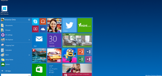
Easy now. Easy. Recent leaked releases of screenshots for internal Windows 10 Builds show some not-so-stylish icons on the Windows 10 desktop. Some say the icons are bland and flat, and resemble Microsoft trying to copy Chrome OS or iOS styles and that they need to go.
Without a new Build in testers’ hands for over a month (January 23 was the last Insider release), and the Windows Insider crowd getting antsy, the leaked screenshots are all anyone has to go on. The next Windows 10 Build should be released very soon and we can then get a real sense of the technical functionality that Microsoft has been working on.
But, since images are the only thing we have right now, it makes sense that the majority of comments are based on the appearance. And, that hasn’t stopped anyone from lobbying to have the icons changed.
Microsoft continues to push testers to comment and make suggestions through the Windows Insider program’s official mechanisms, but it’s difficult to use those mechanisms to comment on things you can only see in images for now. So, a lot of folks have taken to Twitter to voice concerns over the icons directly to Gabriel Aul, the Windows Insider chief.
Many, though, have given Microsoft the benefit of the doubt, knowing that the icons and design in general are only a small part of the development progression, and have proposed that the icons are just placeholders until design becomes a more critical part of the process.
Mora @ Winsupersite

